love & connections family services
The power of love.
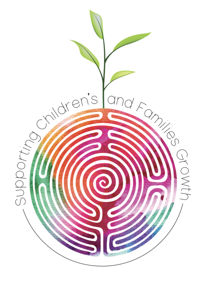
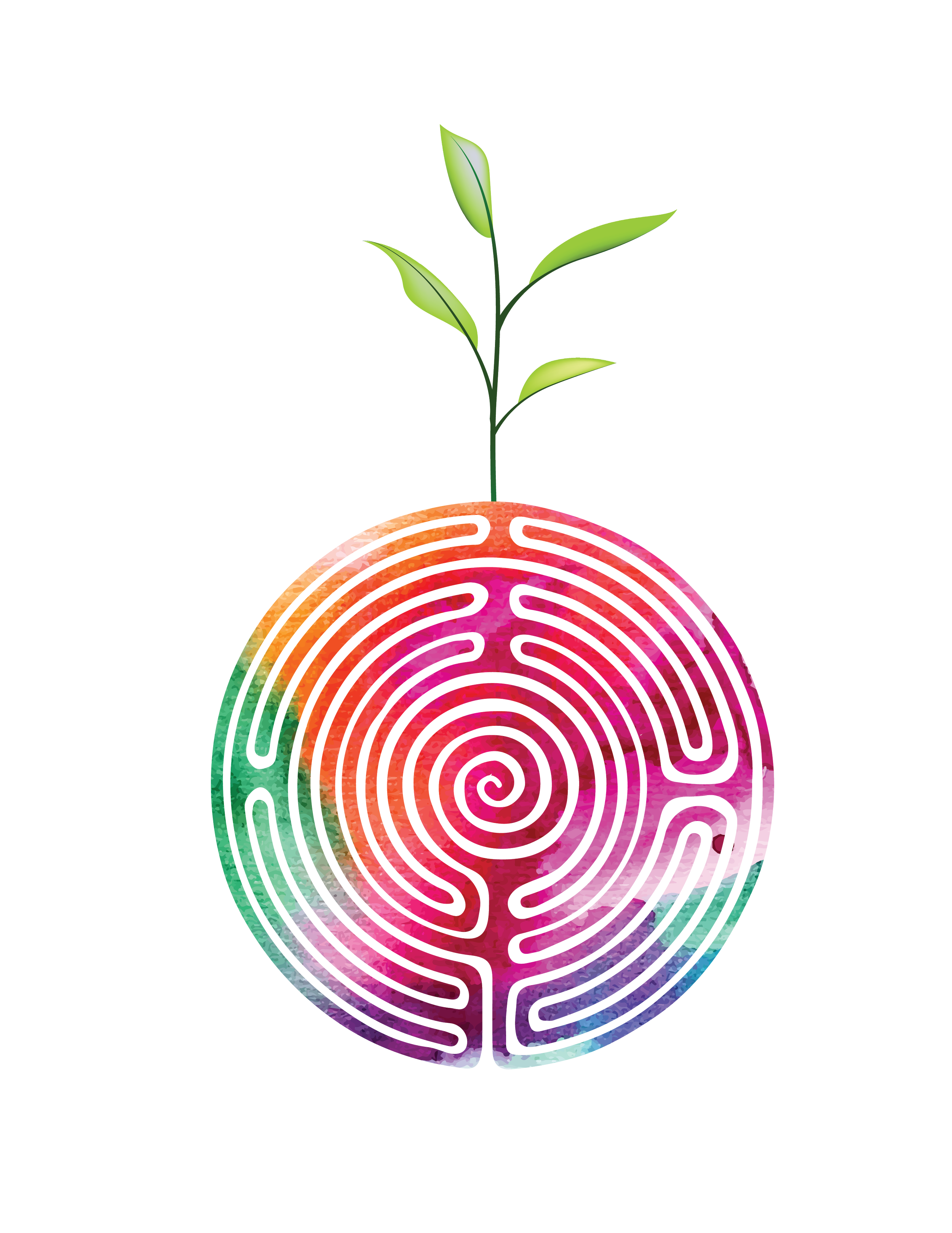
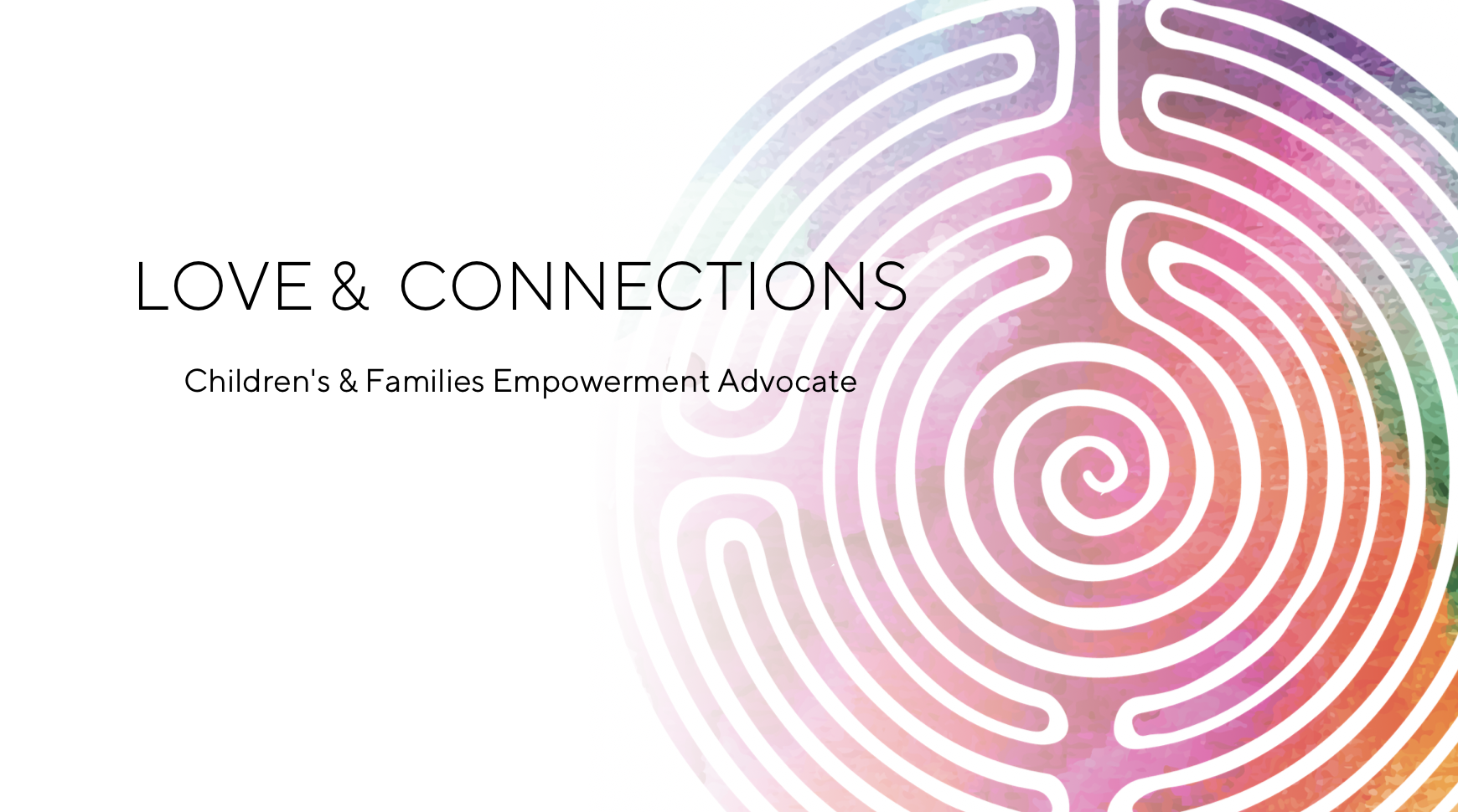
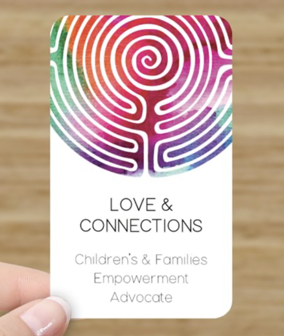
Driven by the Hero's Journey, my client Jenny needed a logo for her family support services that was colourful and meaningful. The labyrinth icon was dear to her heart so we added colour and some literal elements such as the sapling. Needing to include a lot of text for her services was challenging however, that is why I usually encourage less is more with logo design that includes text.
I pride myself on not overwhelming clients with too many options. Instead, tuning into their needs, how they communicate with their clients, and how their clients respond to info graphics. It’s not about me!